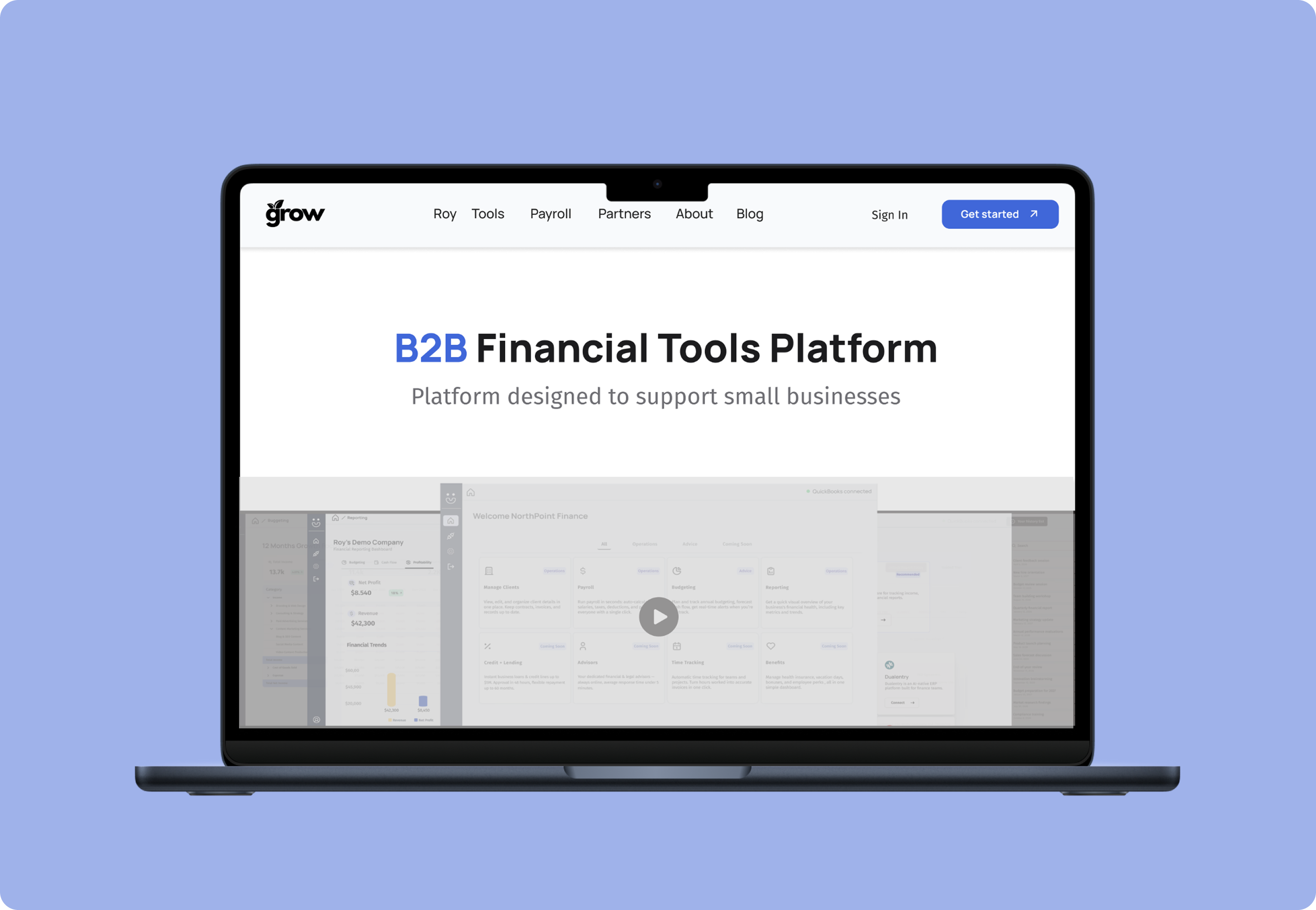
Web Design & Development · Case Study
One clinic.
One voice.
Built from nothing.
Graceland Medical Clinic & Pharmacy in Mission, BC launched with no digital presence. Brand identity, copywriting, design, and 100% custom code — all built from scratch.
Overview
Graceland Medical Clinic & Pharmacy is a newly opened healthcare facility in Mission, BC offering integrated family medicine and on-site pharmacy services. The challenge: launch a brand from zero and make the community trust them before meeting a single doctor.
The problem
A brand-new clinic with no digital presence in a community where patients rely on online search to find healthcare. Without a website, they simply didn't exist.
The goal
Build a complete digital presence that earns patient trust instantly — before they've met any doctor — and drives new patient bookings.
My scope
Brand identity, full copywriting, web design and 100% custom HTML/CSS/JS on WordPress. One person, every layer.
The constraint that shaped everything: working solo across brand, copy, design, and code meant no separate research, QA, or content team to lean on. Every decision — from the palette to the hero copy — had to be made and shipped by one person, on a 1–3 month timeline.
Industry research
Secondary research on the healthcare digital landscape in Canada, not primary research conducted for this clinic, helped frame the strategy below.
72%
of patients judge a clinic's credibility based on website quality alone before booking
48%
abandon the booking process if the clinic website feels outdated or unclear
3×
more likely to book when clinic and pharmacy are presented as one integrated experience
67%
of new patients search on mobile when looking for a family doctor in their area
Persona
Sara R.
35 · Mission, BC · Working parent, new to the area
"I just moved to Mission. I need a doctor for my kids and myself — fast. I don't have time to call around. I want to book online and know they're actually accepting patients."
Goals
- Find a family doctor accepting new patients
- Book online without calling
- Get prescriptions filled at the same location
- Feel confident before the first visit
Frustrations
- Clinics with no online booking
- Websites with no clear "accepting patients" info
- Having to drive to a separate pharmacy
- Unclear hours and contact information
Behaviours
- Searches on mobile during commute
- Reads Google reviews before deciding
- Checks hours before calling or booking
- Decides within 60 seconds of landing
Tech comfort
- High — uses apps for everything
- Expects mobile-first experience
- Trusts well-designed sites more
- Leaves immediately if site is slow
Assumptions & hypotheses
Assumptions I started with
New patients judge clinic trust within seconds of landing on the website.
A clinic with no web presence effectively doesn't exist to new patients in Mission.
Integrated clinic and pharmacy is a rare and powerful differentiator in the local market.
Most visitors arrive on mobile and decide whether to stay within 10 seconds.
Hypotheses I designed toward
If the hero section clearly states "accepting new patients," bounce rate will drop significantly.
Presenting clinic and pharmacy as one unified experience will increase time on site and booking confidence.
Visible hours on every page will reduce phone calls for basic info and increase online bookings.
A mobile-first layout with one clear CTA above the fold will convert more first-time visitors.
How might we
Core HMW question
"How might we help Mission families trust a brand-new clinic enough to book their very first appointment — entirely online — without ever having met the team?"
How might we communicate "we're accepting patients" before they scroll?
How might we make clinic and pharmacy feel like one seamless service?
How might we reduce friction for someone who has never heard of this clinic?
Empathy map
Understanding what Sara says, thinks, feels, and does when searching for a new clinic shaped every copy and design decision on the site.
Says
- "Are they actually accepting new patients?"
- "Can I book online or do I have to call?"
- "Is the pharmacy inside the clinic?"
- "What are their hours on Saturday?"
Thinks
- "This clinic is new — can I trust them yet?"
- "I don't want to drive to two separate places."
- "What do other patients say about them?"
- "Is this even worth clicking into?"
Feels
- Anxious about switching to an unknown clinic
- Relieved when hours and info are immediately clear
- Frustrated by vague or outdated clinic websites
- Hopeful when a site feels professional and trustworthy
Does
- Googles "family doctor Mission BC accepting patients"
- Clicks the first 2–3 results and compares
- Checks hours and contact before deciding
- Leaves if the page loads slowly or looks outdated
Solution overview
Four core design decisions — each directly mapped to a patient insight or hypothesis.
Trust-first hero section
"Accepting new patients" badge and a single booking CTA visible above the fold on every device. No scrolling required to take action. This was the top priority because 72% of patients said they judge a clinic's credibility from the website alone, before ever calling or booking.
Clinic + pharmacy as one
Both services presented as one unified experience with a shared navigation and cross-linked content — not two disconnected pages.
Hours always visible
Hours, phone, and same-day triage info persistent across all pages. Patients get answers without hunting — reducing friction to zero.
100% custom code
Every line of HTML, CSS, and JS written by hand on WordPress. No page builders, no templates. A page-builder theme was ruled out because 48% of patients said they'd abandon booking on a clinic site that felt slow or outdated, and 67% were searching on mobile, where load time and layout control matter most.
Design system
Typography
Display — Cormorant Garamond
Graceland Medical
Your health, our priority.
Body — IBM Plex Sans
Expert Medical Care in Mission, BC.
Graceland Medical Clinic & Pharmacy brings together trusted family medicine and a fully integrated on-site pharmacy.
Colour palette
Design principles
Trust before beauty
Every visual decision serves credibility first. Clean, medical, approachable — never cold.
Mobile-first always
67% of healthcare searches happen on mobile. Every layout was designed at 375px first.
One CTA, one decision
Never compete for attention. Each page has one primary action: book an appointment.
Final designs
The integrated pharmacy page — the site's core differentiator — fully responsive and custom coded. The remaining pages (home, clinic, patient resources) are live on the production site linked below.
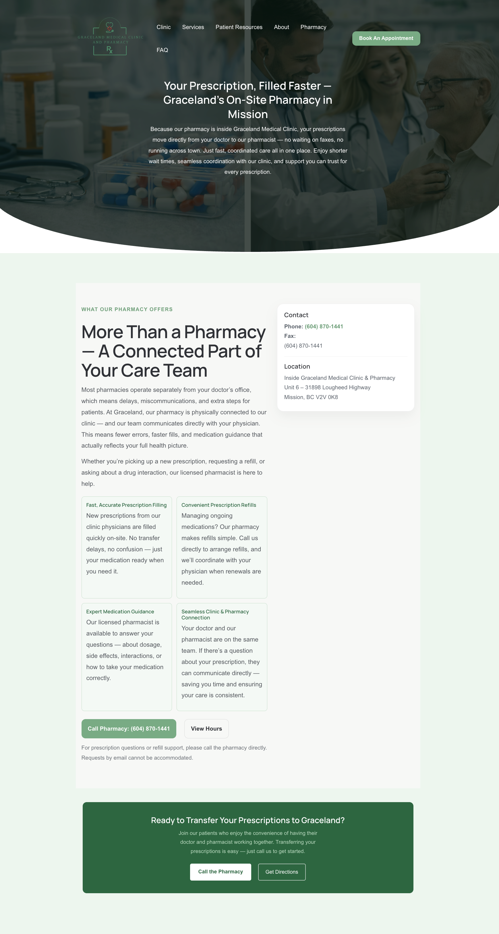
Rx pharmacy — info & hours, presented as one experience with the clinic
Impact & next steps
No formal analytics were instrumented for this launch, so the honest impact is scope and craft, not a metrics dashboard — here's what actually shipped, and what I'd do next with more time.
What shipped
One person carried brand identity, copywriting, design, and 100% custom code from a blank domain to a live site — with no separate research, QA, or content team to lean on.
- Full brand identity and voice, built from zero
- Home, clinic, pharmacy, and patient resources pages, all hand-coded
- A trust-first hero pattern reused consistently across every page
- Site is live and in production at glmedicalgroup.ca
Where I'd go next
Instrument booking-funnel analytics to see where the trust-first hero and mobile-first layout actually move the needle, instead of relying on assumptions.
Run short follow-up interviews with the clinic's first real patients to validate the Sara R. persona against who is actually booking.
A/B test the "Accepting new patients" hero messaging against alternative phrasing to see if it's really the strongest trust signal.
Run a full accessibility pass — contrast, keyboard navigation, screen reader support — since this shipped solo without a dedicated QA step.
Key learnings
01
Trust is earned above the fold
Patients don't scroll to find trust signals. The hero section must do all the heavy lifting — status, credibility, and action in one view.
02
Copy is design
Writing "Accepting New Patients" instead of just "Book Now" changed the entire emotional tone. Every word is a design decision.
03
Integration is a feature
Clinic and pharmacy under one roof is genuinely rare. Making that visible and clear was the single biggest differentiator in the market.
04
Custom code = full control
Building from scratch on WordPress meant zero compromise on performance, animation, or layout — and a faster, lighter site than any template.